

It’s important to select a font or script that accurately represents your company, special occasion or message.
Your brand style is like a window into the integrity of your organization or company. The font you choose to identify your brand sets a tone.
“As simple as it may sound, a font can really speak to people and call attention to your brand,” said Kristy Fiely, a web and graphic designer at Totally Promotional.
The good news is there are thousands of fonts out there and more being created every day. The bad news is not every font is appropriate for your needs. To save you from a font disaster, I’ve gathered a few experts in the field to share their knowledge.
What to consider when choosing a font for business
Choosing an appropriate font to accent your company logo starts with a personal evaluation, according to Amber Brannon, the founder of Copperheart Creative.
“In order to create consistency across all touch points, you must first understand who you are, who you’re not and how to portray that information accurately to your customers,” she said.
Font consistency is key to building trust
Creating a memorable brand is important to the success of every business.
“You want to be sure to always keep your branding consistent so customers recognize you across the board,” Fiely said. “The best way to do this is to always use your branded fonts and colors.”
The goal is to make your business logo as recognizable as possible to customers and potential clients to promote credibility.
Large inconsistencies in your brand will set off red flags in your customers’ minds during the buying process.
Amber Brannon, branding design professional
Today’s consumers don’t just focus on deals. They want quality goods and services from companies they trust.
“A cohesive, consistent brand creates trust, value and quality,” Brannon said. “Think of it this way: In your buyer’s eye, the effort you’ve put into your outward appearance is a direct reflection of the quality they can expect from your products and services. That’s branding in a nutshell.”
Confusion about the identity of your business can turn customers away.
“Large inconsistencies in your brand will set off red flags in your customers’ minds during the buying process,” Brannon noted.
How to select fonts to accent your logo
To find the perfect accent font for your logo, you need to identify its style. Is your logo design masculine, clean, girly, modern, chic, sleek or timeless?
“Just like pairing a top with bottoms when getting dressed, you want to find a font that compliments your logo,” Brannon said.
Avoid accent fonts that overpower your logo. Fonts that are too bold or busy can be overwhelming, she said.
Jenn Jacobs, digital designer at Totally Promotional
“Two to three fonts should be maximum for a design to avoid a cluttered look.”
“If your brand is girly, you might be able to add a font that is more feminine like a script or petite slab font,” Brannon said.
Many logos use one font for the headline and another in the body. Jenn Jacobs, a digital designer at Totally Promotional, warned against using too many fonts in one design.
“Two to three fonts should be maximum for a design to avoid a cluttered look,” Jacobs said.
Your main objective should be making your text easy to read. You may like a certain font for its elegance but if it’s difficult to read it may get negative attention.
Best brand fonts for all types of marketing
If your logo will appear in print and online you may want to consider creating a “font-family” for your brand. Brannon said it’s something she does for clients during the branding process to promote flow and consistency. She likes to pair great headline fonts with clean and easy-to-read copy fonts.
Fonts that are accessible and flexible across many different platforms include:

Avenir: Designer Adrian Frutiger created this font in 1988. The linear sans uses the stylistic developments of the twentieth century. Avenir features thick, vertical strokes, an “o” that is not a perfect circle and shortened ascenders. It is a harmonious font for text and headlines.

Muli: The principal designer is Vernon Adams. The sans-serif font mainly serves as a display font but also works well as a text font. Its lack of bold weight prevents it from being an ideal body font. Muli is common on websites and is easy to read on all types of devices.

Gotham: Designer Tobias Frere-Jones created the Gotham family of fonts more than a half century ago. In 2000, it was re-introduced and is very popular for its versatility. Gotham is the go-to font for numbers and letters on landmark buildings around the world. Several versions are available for different types of media.

Asap: Pablo Cosgaya created this sans-serif font. It is a contemporary font known for its subtle, rounded corners. Asap was specifically designed for desktop and screen use. Its standardized character width is a huge plus for users who can quickly change type styles without reflowing a text body.
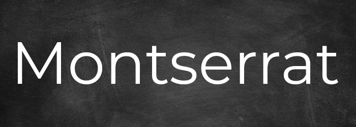
Montserrat: The name of this font comes from the neighborhood of Buenos Aires where principal designer Julieta Ulanovsky resides. Her inspiration was the urban typography she found in the signage throughout her community. Montserrat is a sans-serif family with a geometric style often used for the web.

Work Sans: Wei Huang, an Australian designer who was born in China, created the Work Sans font. It works as an on-screen text with its medium sizes and in print designs. Work Sans mimics the design of early grotesques and has become increasingly popular on the web.

Poppins: Indian Type Foundry created this font for print and digital media in 2014. Big companies such as Apple, Google and Sony use it frequently. Its geometric sans-serif typeface is nearly monolinear.

Lora: Creator Cyreal is the principal designer of this contemporary sans-serif font. Lora is a text typeface that boasts moderate contrast. It is an ideal body text with brushed curves and driving serifs. Lora is perfect for the web and in print.
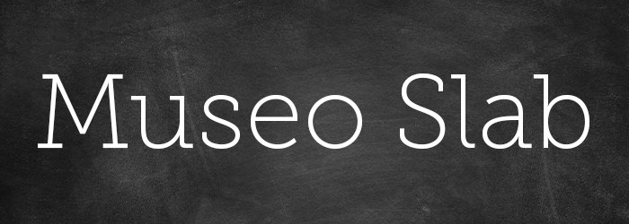
Museo Slab: Dutch designer Jos Buivenga created this font, which became available in 2009. It is a robust slab serif with a friendly, warm appearance. It is most similar to Sanchez and Calvert fonts.

Zilla Slab: Typotheque is the principal designer of this contemporary slab serif. It features smooth curves and true italics for a sophisticated, industrial look. Zilla Slab is Mozilla’s core typeface.
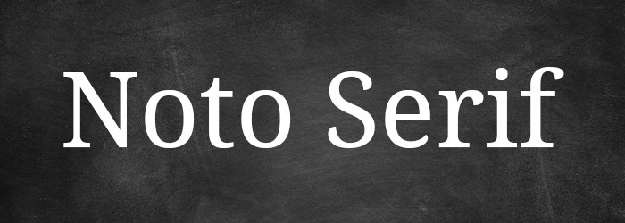
Noto Serif: Google created this font to correct characters that computers cannot display. It is from the Serif Latin, Greek and Cyrillic family. The Noto fonts are visually harmonious across many languages with compatible heights and stroke thicknesses.

Oswald: This is one of several fonts created by designer Vernon Adams. The Alternate Gothic sans-serif typefaces were the foundation for Oswald. The transformation of the design makes this font a better fit for the pixel grid of today’s digital screens.
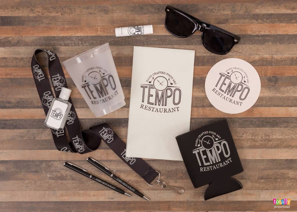
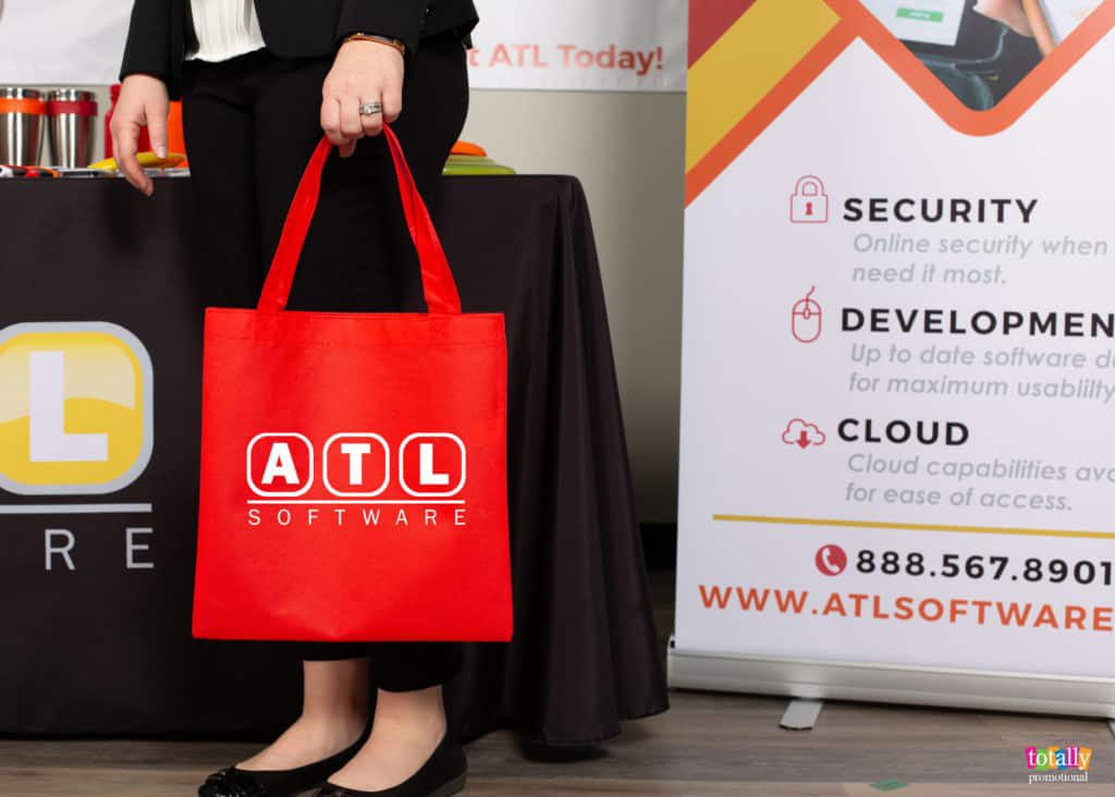
Selecting fonts for corporate events and gifts
Keeping consistency in your brand is important for marketing your company. But it’s OK to bend the rules slightly when choosing fonts to customize guest favors or employee gifts for corporate Christmas parties, anniversaries and other special events.
Brannon suggests using the 80/20 rule: 80 percent of your overall design should reflect your existing brand guidelines and font family; 20 percent can be flexible. The 20 percent addition might be a specialty font or accent color to slightly change things up.
How to choose a font for party favors
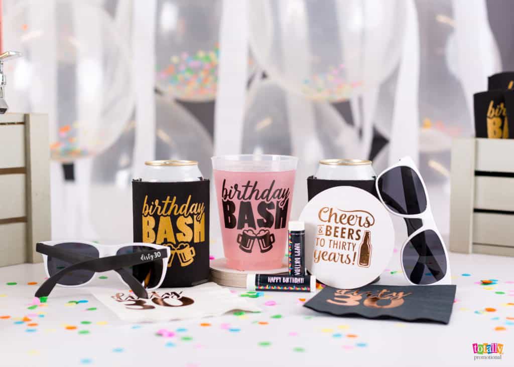
A lot of factors go into choosing fonts for customized party favors and giveaways for special events. The size of the promotional product and your logo, and the amount of text you want to be printed on the items can dictate your options.
The products you are personalizing are for others, so keep their preferences in mind. Here are a few questions Brannon suggests to ask yourself before choosing the perfect font:
- What are you celebrating? (wedding, birthday party, anniversary, baby shower, etc.)
- Who will attend? Create and describe the general persona of your guests.
- How do you want your guests to feel? (love, joy, care-free, nostalgic, excited, wild, emotional)
- What is the theme/aesthetic you are trying to accomplish? (beach, over-the-hill, modern, romantic)
- What do you immediately think of when pondering your theme? Write down the adjectives and nouns that quickly come to mind such as colorful, dreamy, palm trees or Hawaiian leis.
Now it’s time to find fonts to match your answers. How? Just “Google it!” said Brannon. Simply type in your answers from the questions above and add the word “fonts” in your search. Click on the Google or Pinterest images that catch your eye.
Condense your list of favorite fonts by asking: Is this font appropriate for the occasion? Will my guests love it? Will it create the right emotion? Does it describe my theme? Can I add tasteful artwork accents into my design without overpowering my theme?
When you find a winner, be sure it’s easy to read with your design, Brannon said. Don’t hesitate to ask a few family members or friends to review it (and possibly catch grammar and spelling mistakes!).
Here are a few more general tips for choosing a font:
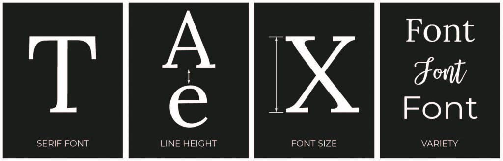
- Serif fonts have detailed “feet” or “kicks” on each letter and can be less crisp when printed in small type.
- Line height — the spacing between each line of text — should be no less than the point size of the text. Many graphic designers prefer the line height to be a minimum of 150 percent of the text size.
- Font size should fit the intent of the content. Use bigger font sizes for the text you want to stand out.
- Look for inspiration from a variety of typography examples. Try your favorites with your logo until you find what suits you.
We can help!
Totally Promotional has an extensive font gallery to help you choose a font that will be perfect for your uniquely customized promotional products. You’ll find hundreds of the most popular san serif fonts, serif fonts, script fonts, handwritten fonts and decorative fonts for every occasion.
If you need professional branding assistance, I highly encourage you to find out more about Brannon. Feel free to contact her for help with your branding strategies.
Totally Promotional has a team of experienced graphic designers to help you choose fonts to customize your promotional items. Don’t hesitate to contact us with questions. We’re here to ensure your success and make your event the best ever!
Our Products. Your Story™.